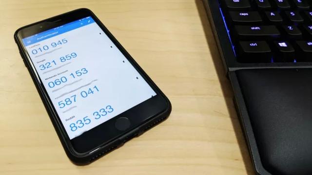
"Why are automakers sticking to touch panels instead of buttons?" Pucho Henza who likes physical buttons
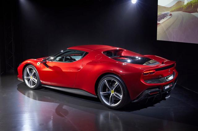
This story has started again. I go to a new car and sit down with the interface designer and they tell me I'm too old and what I want is not what the customer wants. This time, I'm an engineer at BMW, and I'm talking about the new operating system that will be installed in the iX and i4. Today's customers want everything on screen, she said. It's only old-timers like me who want physical switches for climate control, stereo, and driver assistance.
I asked why with a weary sigh. It always does, but why? Because, as always, customers use tablets and phones, they love them, they're good at them, they said. At this point, my voice once again turned into something close to a hysterical scream. I've been complaining that the goodness of the iPad is different from the goodness of the car.
At home, I drink coffee from small glass espresso cups. This is because the heat does not escape, and you can drink while making sure that there are bubbles. But when I drink espresso in the car, I use a plastic container with a lid and a small spout. At 110km/h or on bumpy roads, the combination of a glass cup and an open-mouthed hot liquid must be bad. The same goes for controlling car functions. The screen is basically not a touch panel, and the operation is to touch the buttons with fingers.
That's why you need to stabilize your finger while checking the position to indicate. In other words, what works when you're sitting on the couch with your iPad doesn't work when you're on the go. Not only that. Good mobile phone and tablet software is immersive. As a result, it grabs the user's attention and keeps their eyes glued to it. But the car interface should be the opposite. It must reject your gaze and direct it to the road.
So why the confusion and dangerous insistence on wiping out physical switches? Reason 1: As mentioned above, it was requested by the "customer". Then educate the owner, I would say. Reason 2: Modern cars have so many functions that it's impossible to put switches on them all, and even if they did, it would be impossible to find the right one in the forest of switches. So some screen manipulation menus are necessary. Yeah, I know that all too well. But you don't need all of them.
The third reason is revenue. Consider a car with all the sensors and actuators that can be reused for automated parking. But it's an option. If you add a button, you can't add it later. But if it's a menu on the screen, it could be sold as a wireless "feature on demand" for a fixed monthly fee. Reason 4 is cost. A real switch requires hardware and wiring. For screen control, all you have to do is write a line of code.
Back in the day, most mainstream car dashboards were lined with ugly, blanked-out switch holes, a reminder that the base model lacked the features of the higher-end models. In the old days it was annoying. But now I feel nostalgic.
[Giga Crystal SP]


![10th generation Core i5 equipped 9.5h drive mobile notebook is on sale at 50,000 yen level [Cool by Evo Book] 10th generation Core i5 equipped 9.5h drive mobile notebook is on sale at 50,000 yen level [Cool by Evo Book]](https://website-google-hk.oss-cn-hongkong.aliyuncs.com/drawing/article_results_9/2022/3/9/4a18d0792cae58836b71b9f591325261_0.jpeg)

![[Amazon time sale in progress! ] 64GB microSD card of 1,266 yen and wireless earphone with noise canceling function of 52% off, etc. [Amazon time sale in progress! ] 64GB microSD card of 1,266 yen and wireless earphone with noise canceling function of 52% off, etc.](https://website-google-hk.oss-cn-hongkong.aliyuncs.com/drawing/article_results_9/2022/3/9/c88341f90bab7fe3ce1dc78d8bd6b02d_0.jpeg)
